We add our logo to most of our publications, posters for exhibitions, advertising and to anything where we want our identity known. There are also a few other features we use to help show our identity. This has been achieved in varying ways over the years and following work to clarify our logo this is the agreed way on how we must now use them.
Logo
Introduction
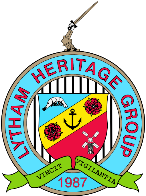
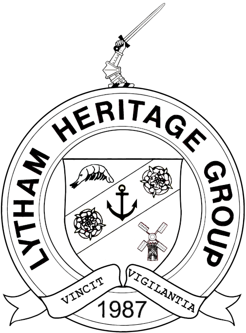
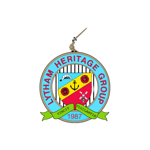
Our logo was designed in the early days of the group and drawn by an artist before computers were widely used. This had the limitations of a hand drawn item in that it required a lot of work to make any changes that would require it to be re-drawn. So since using computers to prepare things we have continued to use a scan of the original document. This had its limitations and so the scanned image was revised to tidy it up and make it more distinctive. Then over time adjustments were made to improve it when used as a small image particularly when overlaying other images such as on posters. All this has been achieved whilst retaining all the elements with variations to fit particular usages.
Logo used as branding on documents
Colour
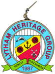
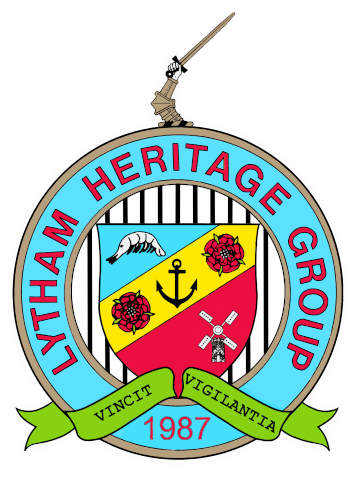
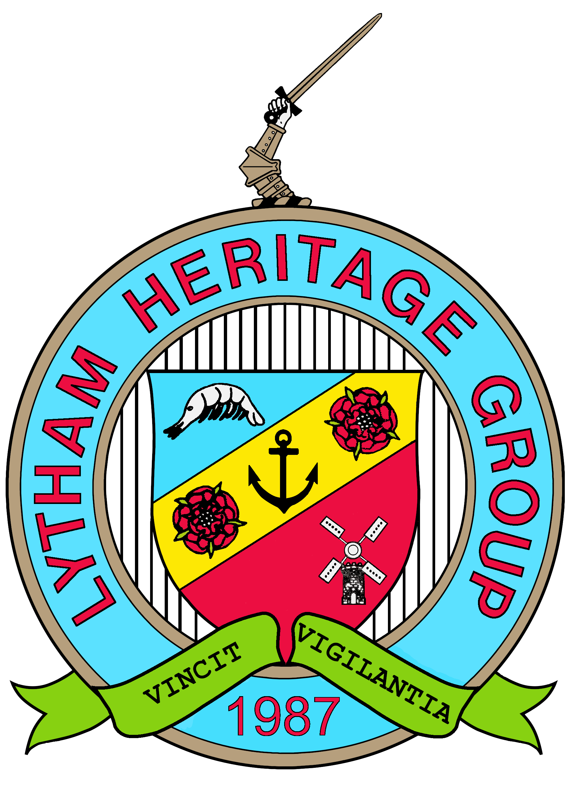
This is the most frequent usage and this is the starting point when selecting a logo image to use. In most cases only a small version of the logo is required and as the original logo is rather tall and thin, the wording isn't always easy to read. So in these cases we now use a smaller sized hand/dagger which makes the logo wider.
Another limitation is the vertical bars behind the shield which join the main components together as this tends to compress into a grey coloured area. This has been resolved by increasing the space between the bars and thickening them.
The remaining constraint is that when a simple transparent background is used the logo can become lost when overlaying a dark busy background image. This has been resolved by providing a thin white border around the logo to provide some colour contrast and this has bit of transparency to reduce its intensity.
- Small logo with transparent background.
- Small logo with minimal background. This is the recommended version to use when used overlaying other images.
- High resolution small logo. This image is useful where a small logo is required but for which a high resolution image is required, e.g. when adding our logo to clothing.
Monochrome
There are some requirements in which we want to add our logo to a document with just back text. The standard small coloured image isn't suitable in these circumstances as the parts with a coloured background become grey and in this usage they are best rendered as transparent. So we have a different image to use on monochrome documents.
Large logo
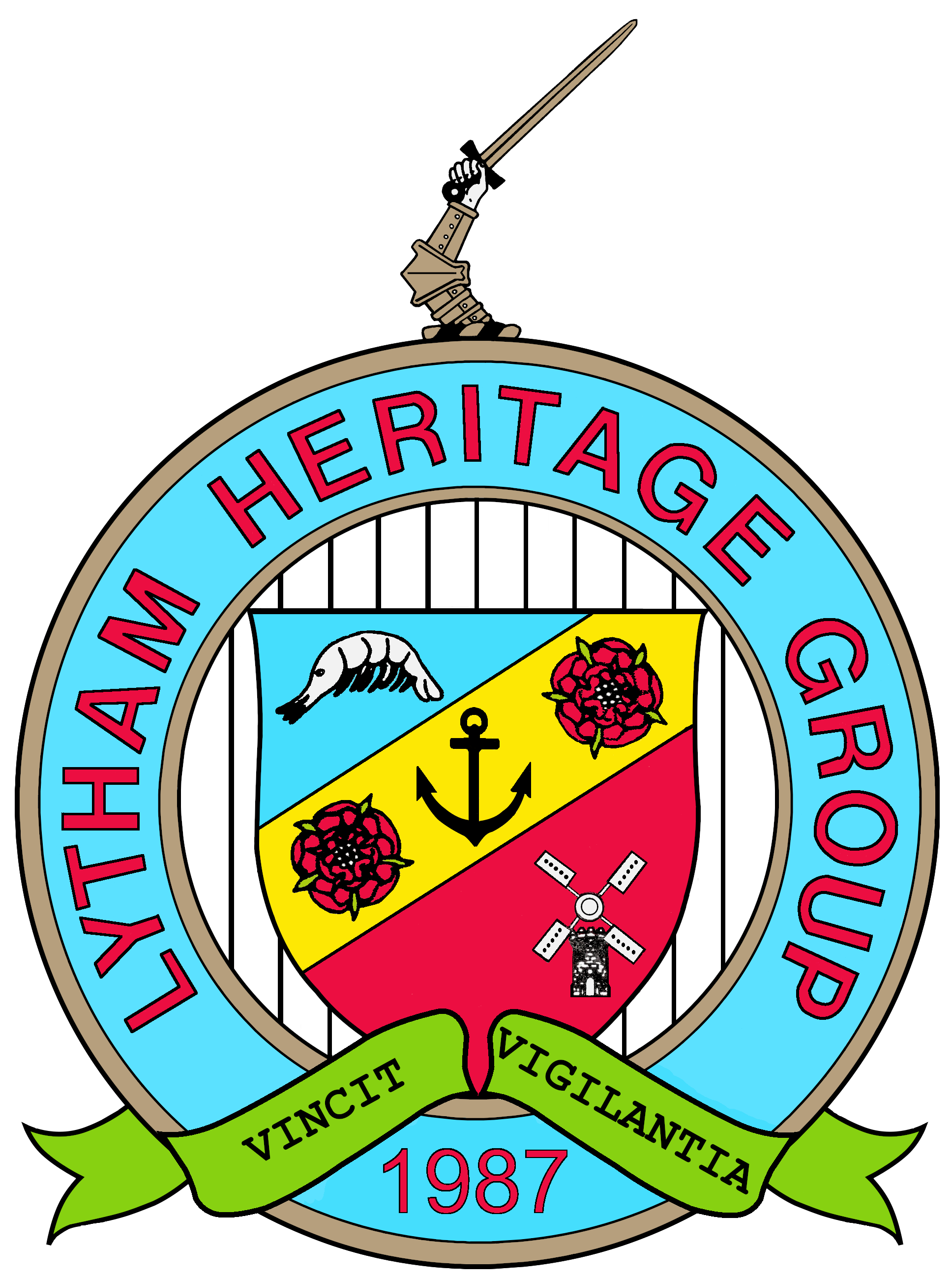
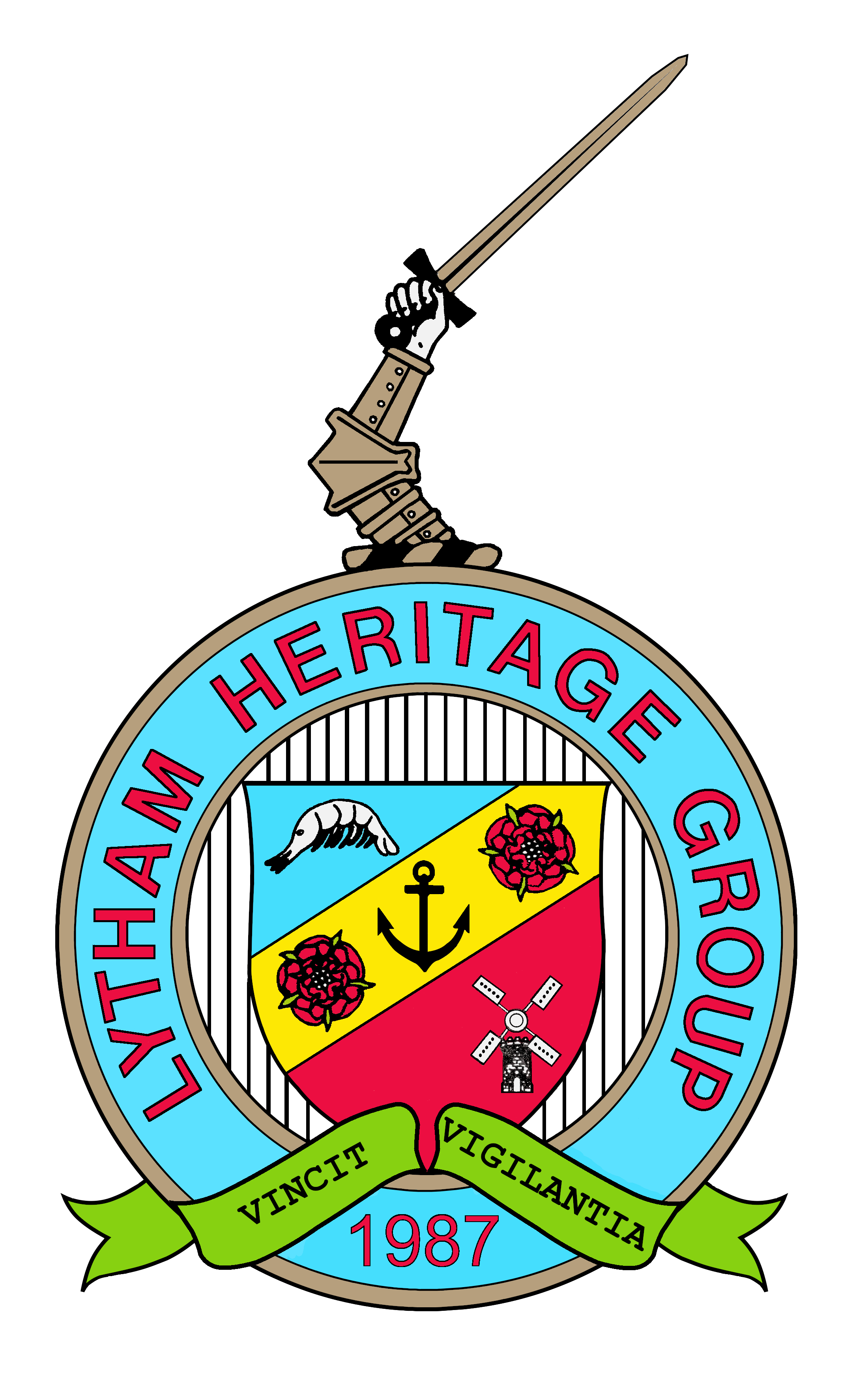
In a small number of cases we use a large image of our logo on items larger than A4 in size where the logo needs to be dominant item. At this size the vertical lines behind the shield are too dominant using the small logo images. So in this case we use a version with more thinner lines.
Where the document is i portrait format a taller version of the logo fits better into the space such as on an A4 sheet of paper or if it was used on a feather flag. So here the larger hand/dagger provides a more attractive version of our logo. However on a flag up on a flagpole that is actually further from the eye the small hand/dagger is better as the wording is larger.
Font
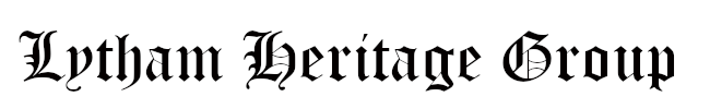
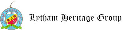
We use the Old English font when printing 'Lytham Heritage Group' on important documents. That isn't provided as standard on most computer systems so it is best to install the font and print the text using it and save that as an image, including the image within the document. If wanting to use it within a web page specify a standard font as an alternative.
Page footer
It can be useful to include text at the bottom of a document telling people that we are a registered charity and that the 'Lytham' in our name includes a much larger area than the portion that is now referred to as 'Lytham'. The recommended text is:
Lytham Heritage Group Charity No 701152
Preserving and Promoting the History and Heritage of the Ancient Parish of Lytham
Special Cases
Social media
A label image can be added to social media which tends to be shown in a small square area. They usually have an algorithm to select part of an image and that seems to require more background space than on our normal images.
Logo with LHG in Old English font
It is useful to add an image to emails to help identify them as originating from LHG. To help make this easier we have an image with the logo and 'Lytham Heritage Group'.
Venues
It can be useful to include a picture of the venue a document relates to or where an event is taking place. We do not have any restriction on images to use for this. To help ease the task of finding suitable images some reasonable ones are provided below.
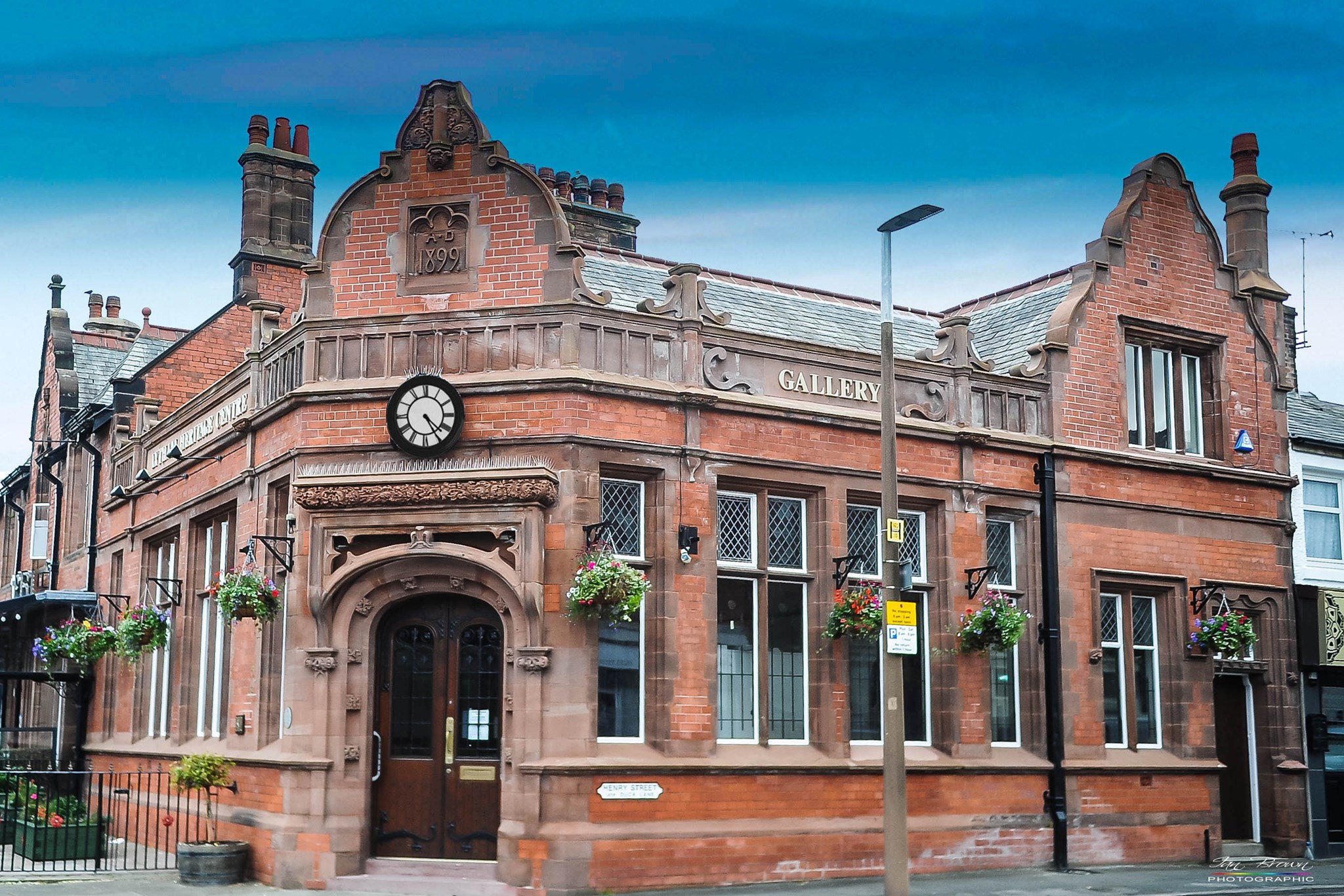
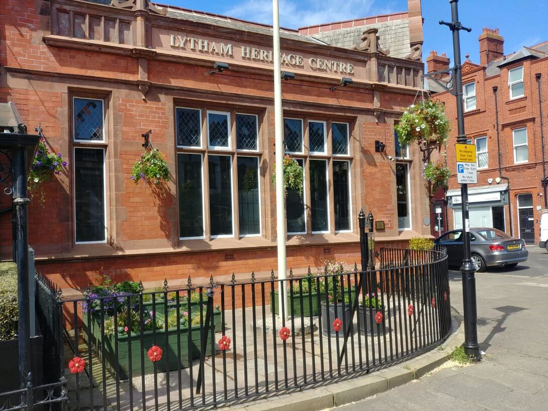
Heritage Centre
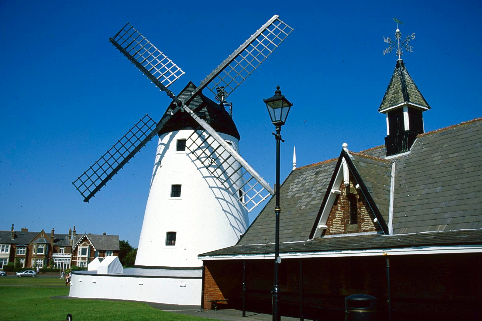
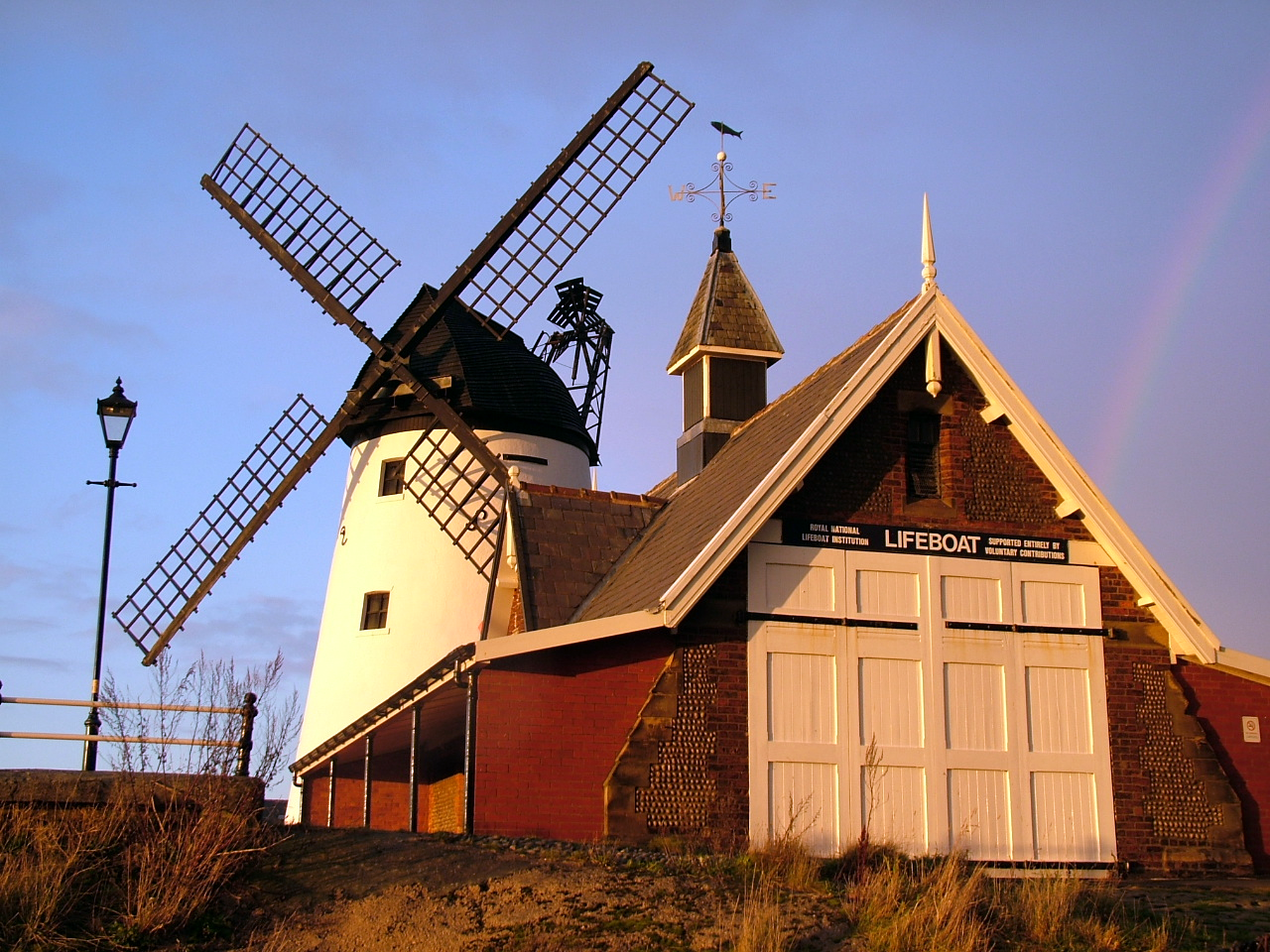
Windmill & Lifeboat house
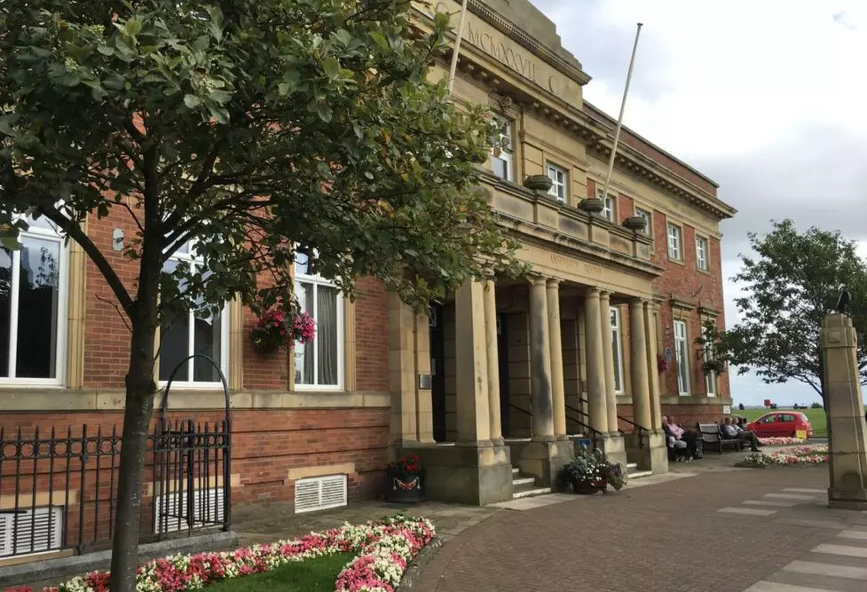
Lytham Institute
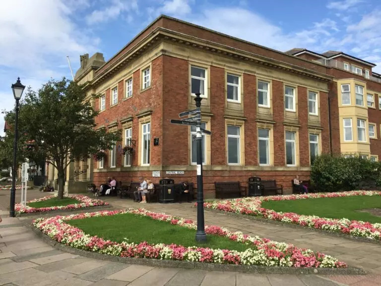
Assembly rooms